

代码拉取完成,页面将自动刷新
本篇将带你深入理解 Flutter 开发过程中关于字体和文本渲染的“冷”知识,帮助你理解和增加关于 Flutter 中字体绘制的“无用”知识点。
毕竟此类相关的内容太少了
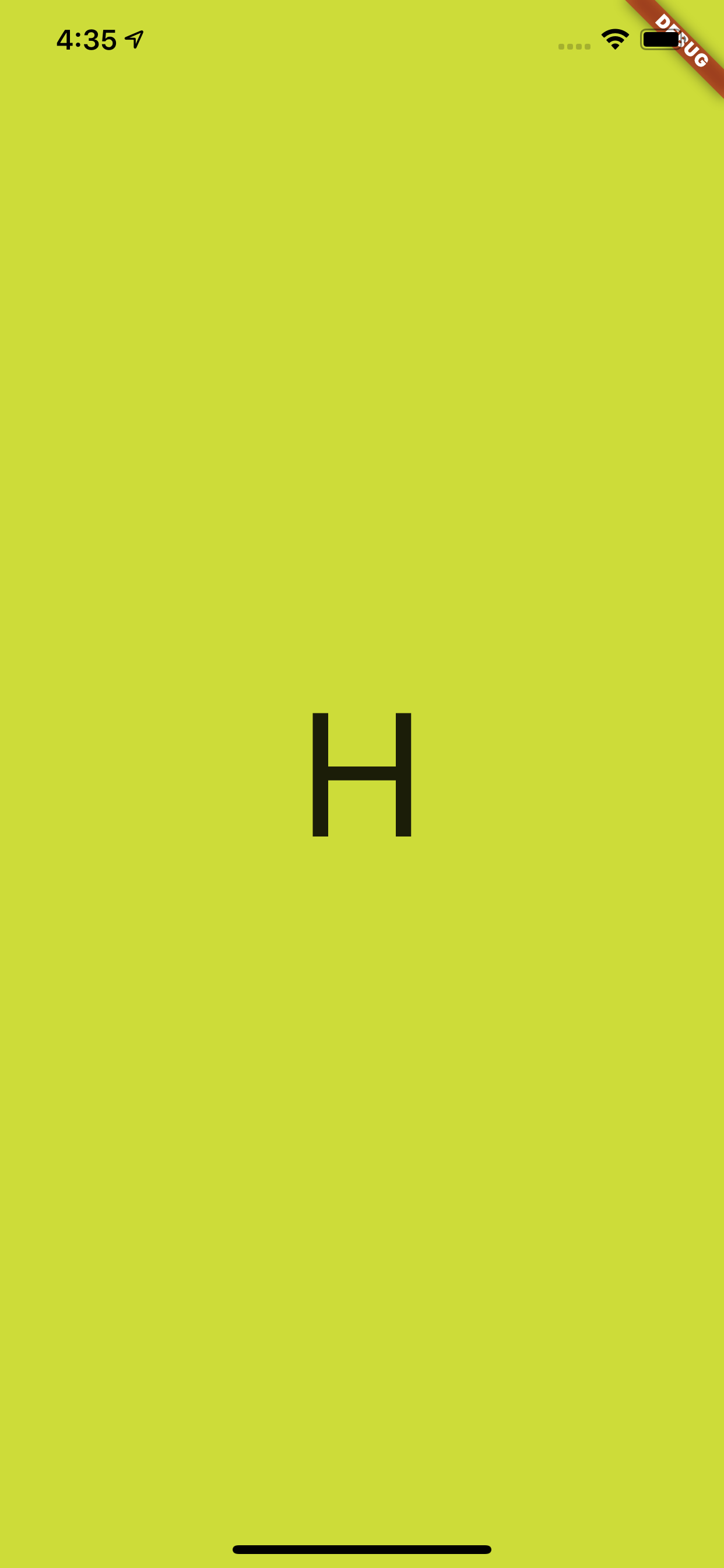
首先从一个简单的文本显示开始,如下代码所示,运行后可以看到界面内出现了一个 H 字母,它的 fontSize 是 100,Text 被放在一个高度为 200 的 Container 中,然后如果这时候有人问你:Text 显示 H 字母需要占据多大的高度,你知道吗?
  @override
  Widget build(BuildContext context) {
    return Scaffold(
      backgroundColor: Colors.black,
      body: Container(
        color: Colors.lime,
        alignment: Alignment.center,
        child: Container(
          alignment: Alignment.center,
          child: Container(
            height: 200,
            alignment: Alignment.center,
            child: new Row(
              children: <Widget>[
                Container(
                  child: new Text(
                    "H",
                    style: TextStyle(
                      fontSize: 100,
                    ),
                  ),
                ),
                Container(
                  height: 100,
                  width: 100,
                  color: Colors.red,
                )
              ],
            ),
          )

        ),
      ),
    );
  }
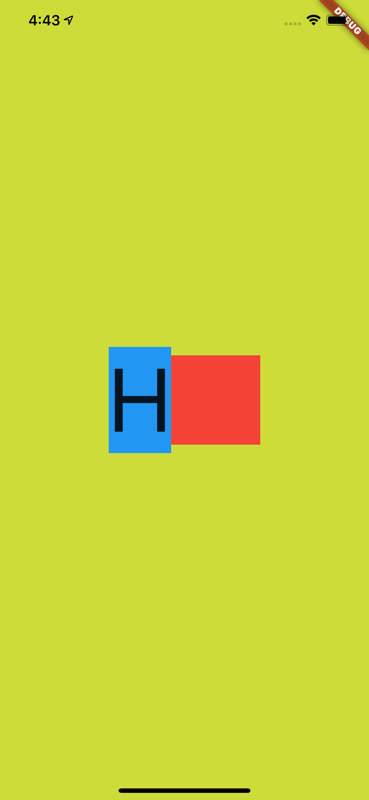
如下代码所示,为了解答这个问题,首先我们给 Text 所在的 Container 增加了一个蓝色背景,并增加一个 100 * 100 大小的红色小方块做对比。
@override
  Widget build(BuildContext context) {
    return Scaffold(
      backgroundColor: Colors.black,
      body: Container(
        color: Colors.lime,
        alignment: Alignment.center,
        child: Container(
          alignment: Alignment.center,
          child: Container(
            height: 200,
            alignment: Alignment.center,
            child: new Row(
              mainAxisAlignment: MainAxisAlignment.center,
              children: <Widget>[
                Container(
                  color: Colors.blue,
                  child: new Text(
                    "H",
                    style: TextStyle(
                      fontSize: 100,
                    ),
                  ),

                ),
                Container(
                  height: 100,
                  width: 100,
                  color: Colors.red,
                )
              ],
            ),
          )

        ),
      ),
    );
  }
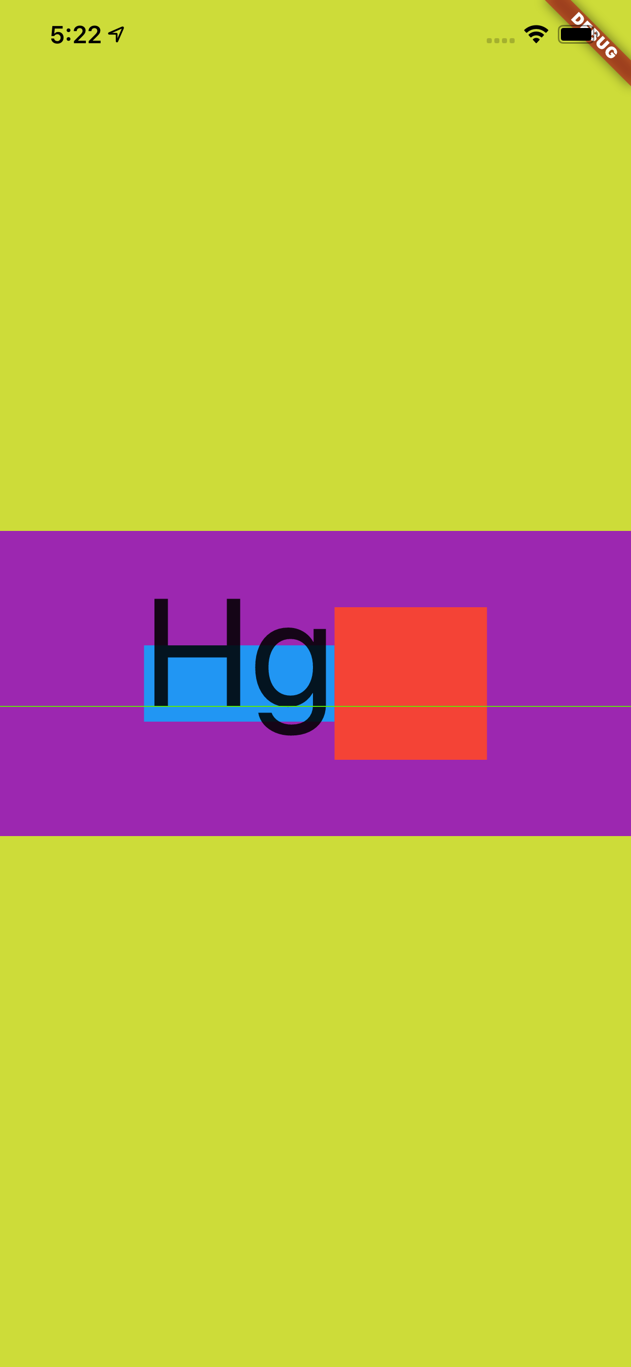
结果如下图所示,可以看到 H 字母的上下有着一定的 padding 区域,蓝色Container 的大小明显超过了 100 ,但是黑色的 H 字母本身并没有超过红色小方块,那蓝色区域的高度是不是 Text 的高度,它的大小又是如何组成的呢?
事实上,前面的蓝色区域是字体的行高,也就是 line height ,关于这个行高,首先需要解释的就是 TextStyle 中的 height 参数。
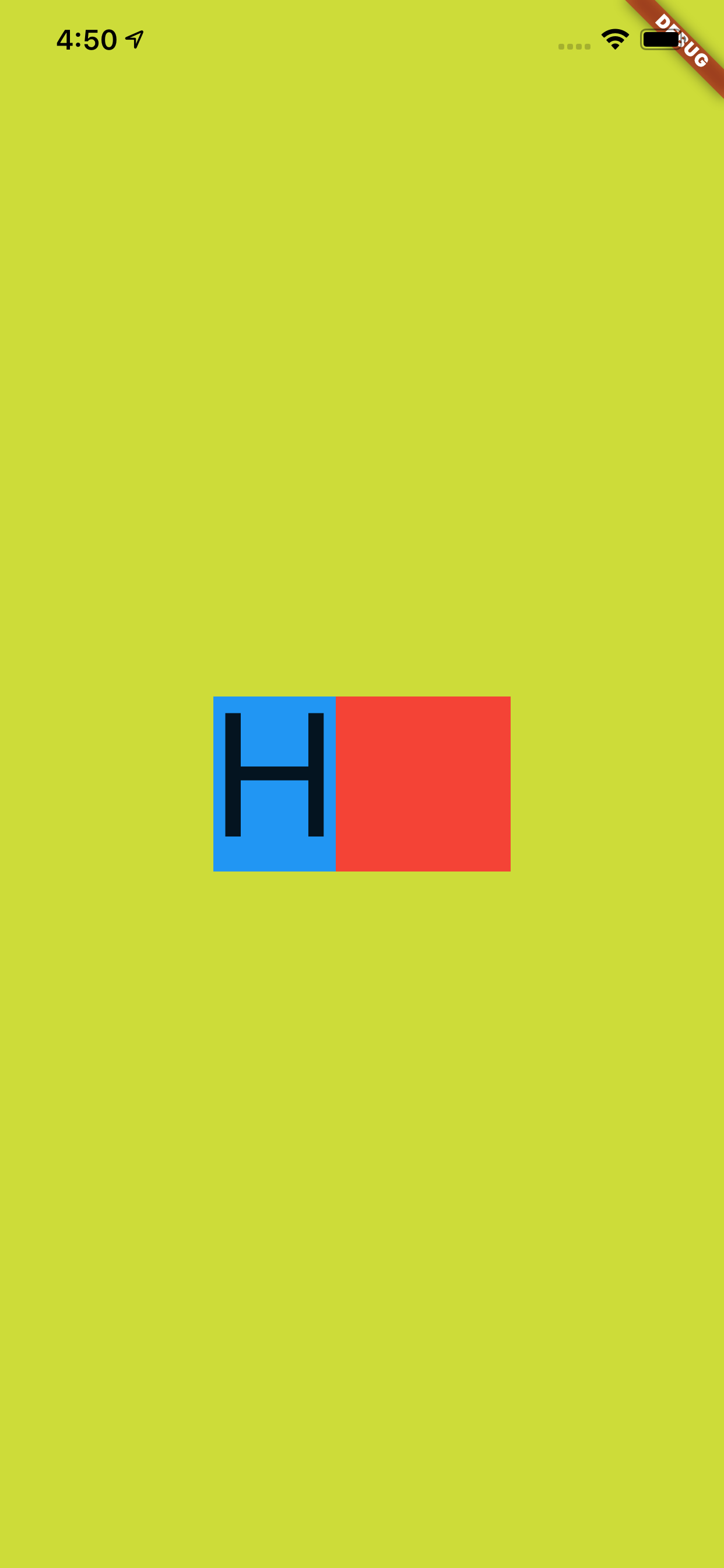
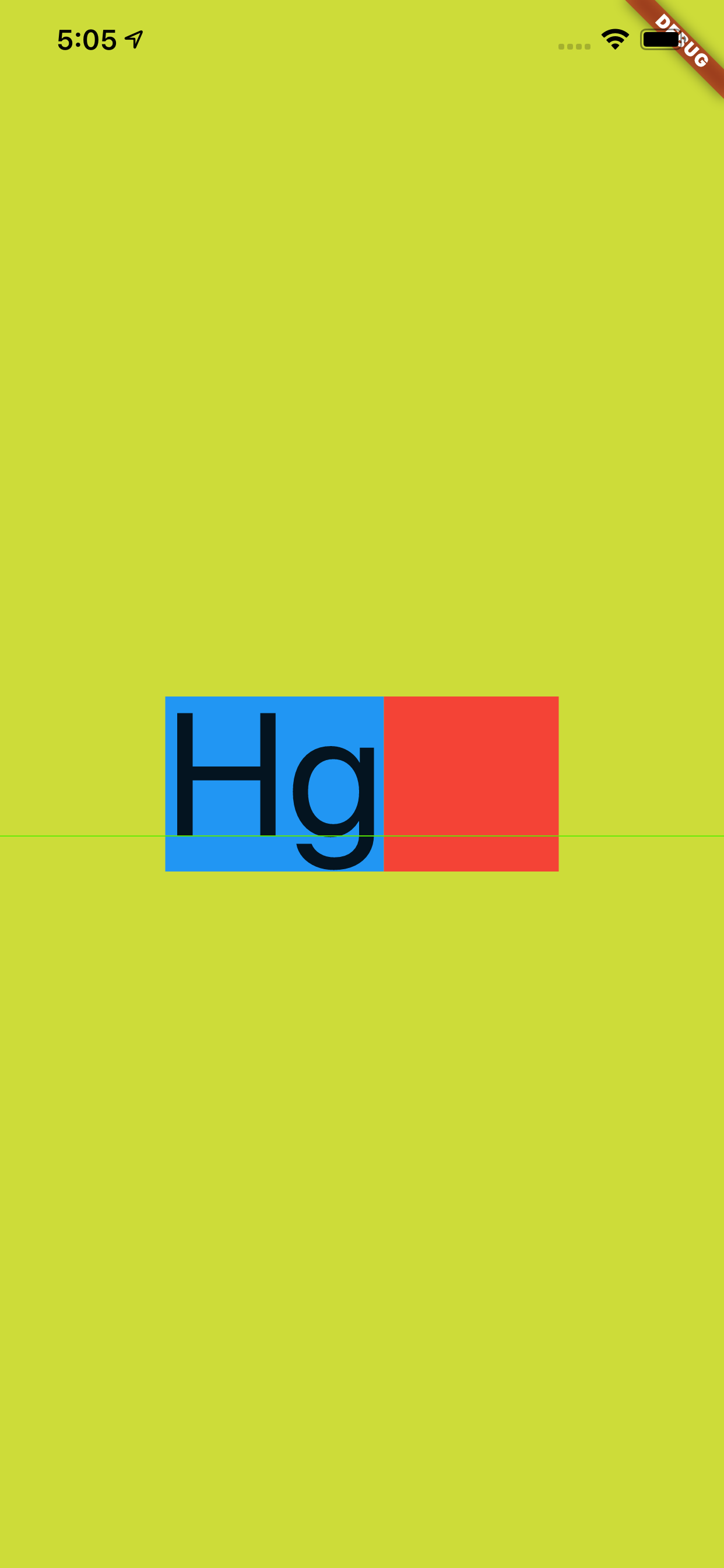
默认情况下 height 参数是 null,当我们把它设置为 1 之后,如下图所示,可以看到蓝色区域的高度和红色小方块对齐,变成了 100 的高度,也就是行高变成了 100 ,而 H 字母完整的显示在蓝色区域内。
那 height 是什么呢?根据文档可知,首先 TextStyle 中的 height 参数值在设置后,其效果值是 fontSize 的倍数:
height 为空时,行高默认是使用字体的量度(这个量度后面会有解释);height 不是空时,行高为 height * fontSize 的大小;如下图所示,蓝色区域和红色区域的对比就是 height 为 null 和 1 的对比高度。
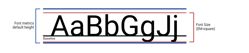
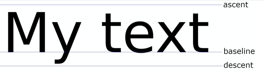
另外上图的 BaseLine 也解释了:为什么 fontSize 为 100 的 H 字母,不是充满高度为 100 的蓝色区域。
根据上图的示意效果,在 height 为 1 的红色区域内,H 字母也应该是显示在基线之上,而基线的底部区域是为了如 g 和 j 等字母预留,所以如下图所示,在 Text 内加入 g 字母并打开 Flutter 调试的文本基线显示,由 Flutter 渲染的绿色基线也可以看到符合我们预期的效果。
忘记截图由 g 的了,脑补吧。
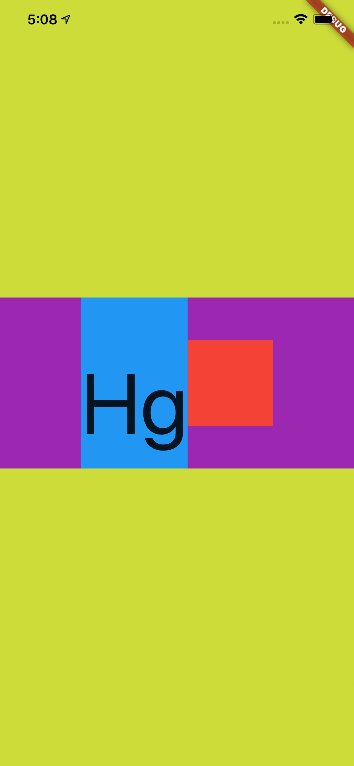
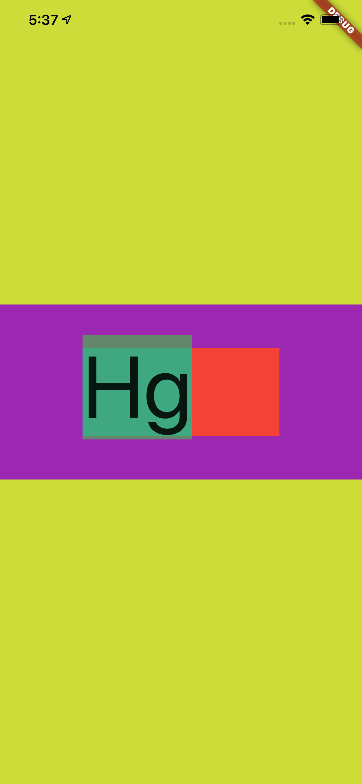
接着如下代码所示,当我们把 height 设置为 2 ,并且把上层的高度为 200 的 Container 添加一个紫色背景,结果如下图所示,可以看到蓝色块刚好充满紫色方块,因为 fontSize 为 100 的文本在 x2 之后恰好高度就是 200。
@override
  Widget build(BuildContext context) {
    return Scaffold(
      backgroundColor: Colors.black,
      body: Container(
        color: Colors.lime,
        alignment: Alignment.center,
        child: Container(
          alignment: Alignment.center,
          child: Container(
            height: 200,
            color: Colors.purple,
            alignment: Alignment.center,
            child: new Row(
              mainAxisAlignment: MainAxisAlignment.center,
              children: <Widget>[
                Container(
                  color: Colors.blue,
                  child: new Text(
                    "Hg",
                    style: TextStyle(
                      fontSize: 100,
                      height: 2,
                    ),
                  ),

                ),
                Container(
                  height: 100,
                  width: 100,
                  color: Colors.red,
                )
              ],
            ),
          )

        ),
      ),
    );
  }
不过这里的
Hg是往下偏移的,为什么这样偏移在后面会介绍,还会有新的对比。
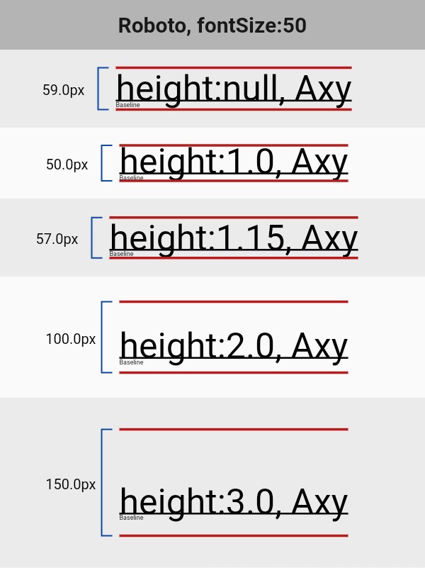
最后如下图所示,是官方提供的在不同 TextStyle 的 height 参数下, Text 所占高度的对比情况。
那再回顾下前面所说的默认字体的量度,这个默认字体的量度又是如何组成的呢?这就不得不说到 StrutStyle 。
如下代码所示,在之前的代码中添加 StrutStyle :
forceStrutHeight 为 true ,这是因为只有 forceStrutHeight 才能强制重置 Text 的 height 属性;StrutStyle 的 height 设置为 1 ,这样 TextStyle 中的 height 等于 2 就没有了效果。 @override
Widget build(BuildContext context) {
return Scaffold(
backgroundColor: Colors.black,
body: Container(
color: Colors.lime,
alignment: Alignment.center,
child: Container(
alignment: Alignment.center,
child: Container(
height: 200,
color: Colors.purple,
alignment: Alignment.center,
child: new Row(
mainAxisAlignment: MainAxisAlignment.center,
children: <Widget>[
Container(
color: Colors.blue,
child: new Text(
"Hg",
style: TextStyle(
fontSize: 100,
height: 2,
),
strutStyle: StrutStyle(
forceStrutHeight: true,
fontSize: 100,
height: 1
),
),
),
Container(
height: 100,
width: 100,
color: Colors.red,
)
],
),
)
),
),
);
}
效果如下图所示,虽然 TextStyle 的 height 是 2 ,但是显示出现是以 StrutStyle 中 height 为 1 的效果为准。
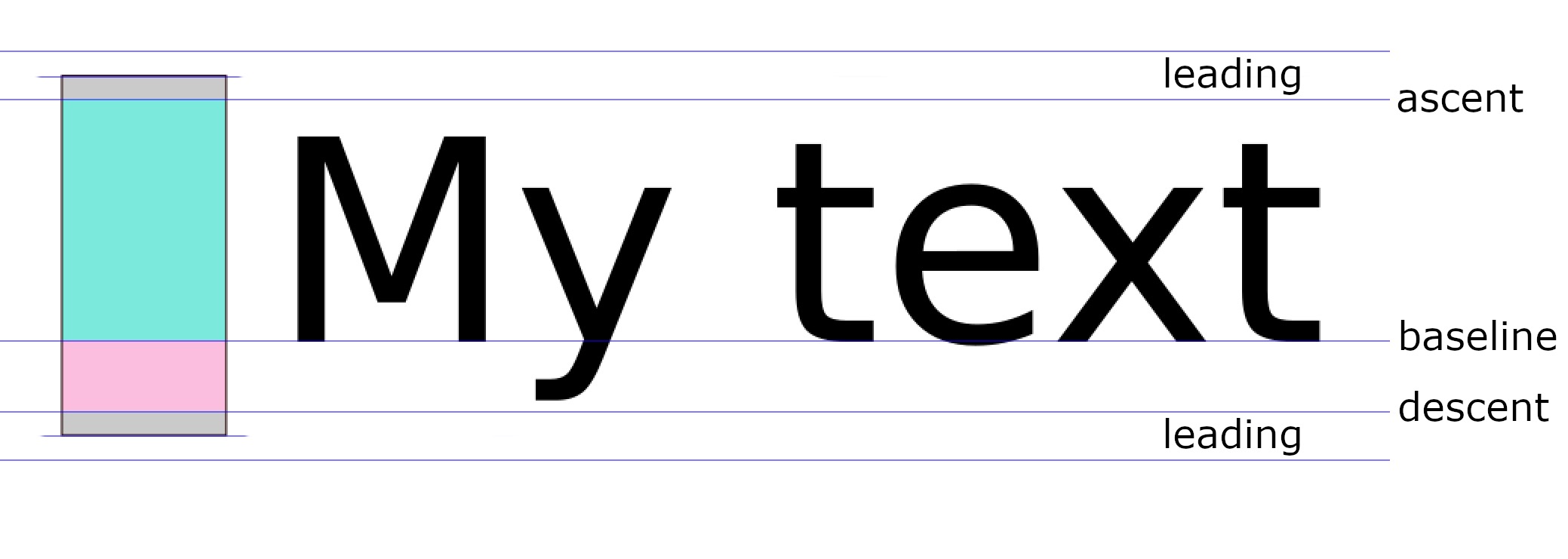
然后查看文档对于 StrutStyle 中 height 的描述,可以看到:height 的效果依然是 fontSize 的倍数,但是不同的是这里的对 fontSize 进行了补充说明 : ascent + descent = fontSize,其中:
ascent 代表的是基线上方部分;
descent 代表的是基线的半部分
其组合效果如下图所示:
Flutter 中
ascent和descent是不能用代码单独设置。
除此之外,StrutStyle 的 fontSize 和 TextStyle 的 fontSize 作用并不一样:当我们把 StrutStyle 的 fontSize 设置为 50 ,而 TextStyle 的 fontSize 依然是 100 时,如下图所示,可以看到黑色的字体大小没有发生变化,而蓝色部分的大小变为了 50 的大小。
有人就要说那 StrutStyle 这样的 fontSize 有什么用?
这时候,如果在上面条件不变的情况下,把 Text 中的文本变成 "Hg\nHg" 这样的两行文本,可以看到换行后的文本重叠在了一起,所以 StrutStyle的 fontSize 也是会影响行高。
另外,在 StrutStyle 中还有另外一个参数也会影响行高,那就是 leading 。
如下图所示,加上了 leading 后才是 Flutter 中对字体行高完全的控制组合,leading 默认为 null ,同时它的效果也是 fontSize 的倍数,并且分布是上下均分。
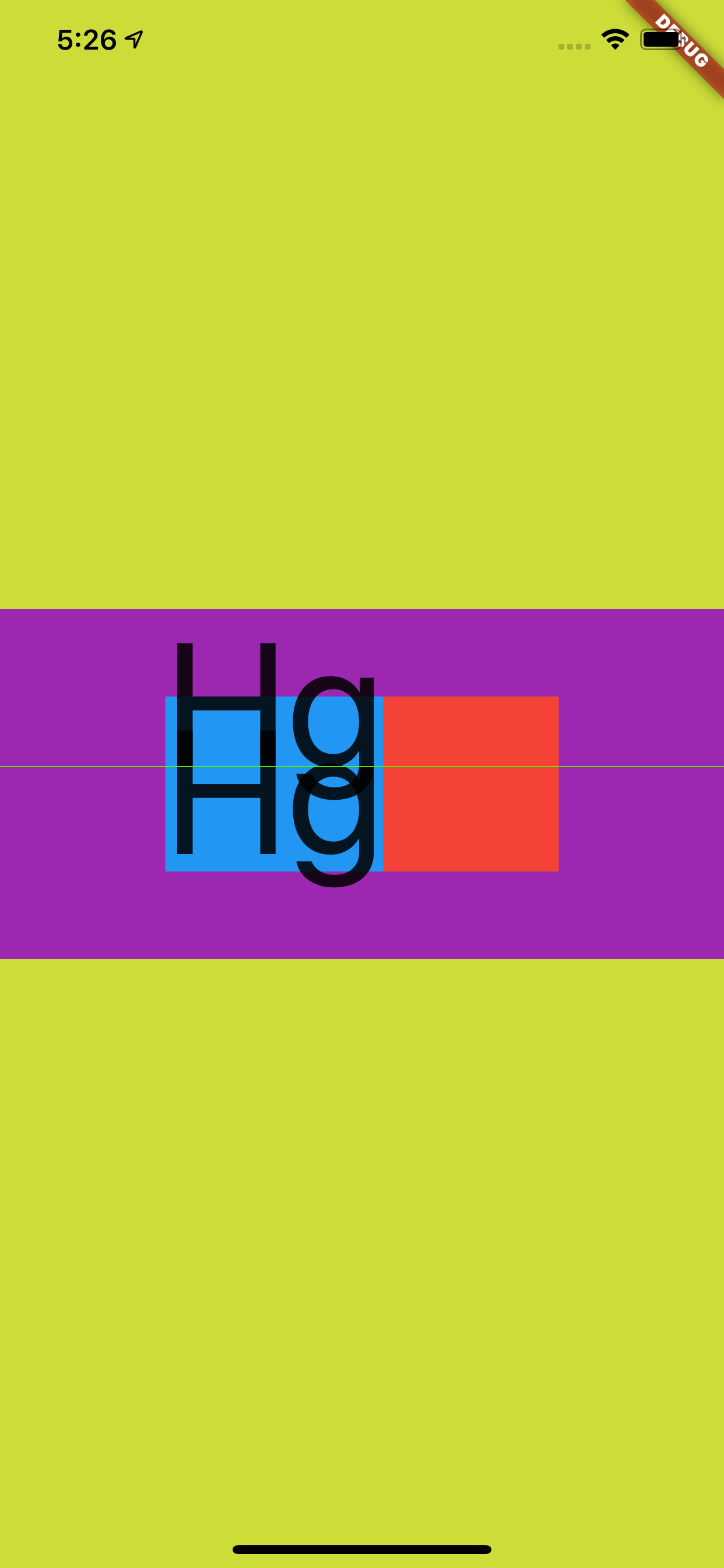
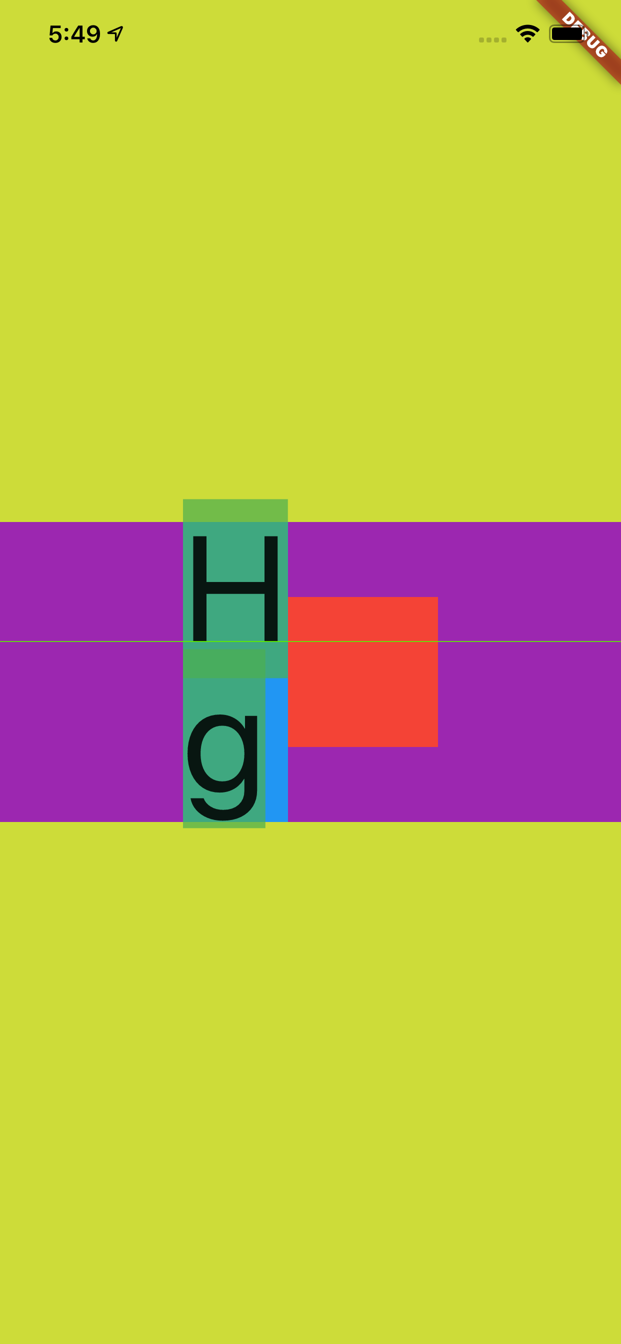
所以如下代码所示,当 StrutStyle 的 fontSize 为 100 ,height 为 1,leading 为 1 时,可以看到 leading 的大小让蓝色区域变为了 200,从而 和紫色区域高度又重叠了,不同的对比之前的 Hg 在这次充满显示是居中。
  @override
  Widget build(BuildContext context) {
    return Scaffold(
      backgroundColor: Colors.black,
      body: Container(
        color: Colors.lime,
        alignment: Alignment.center,
        child: Container(
          alignment: Alignment.center,
          child: Container(
            height: 200,
            color: Colors.purple,
            alignment: Alignment.center,
            child: new Row(
              mainAxisAlignment: MainAxisAlignment.center,
              children: <Widget>[
                Container(
                  color: Colors.blue,
                  child: new Text(
                    "Hg",
                    style: TextStyle(
                      fontSize: 100,
                      height: 2,
                    ),
                    strutStyle: StrutStyle(
                      forceStrutHeight: true,
                      fontSize: 100,
                      height: 1,
                      leading: 1
                    ),

                  ),

                ),
                Container(
                  height: 100,
                  width: 100,
                  color: Colors.red,
                )
              ],
            ),
          )

        ),
      ),
    );
  }
因为
leading是上下均分的,而height是根据ascent和descent的部分放大,明显ascent比descent大得多,所以前面的TextStyle的height为 2 时,充满后整体往下偏移。
那么到这里应该对于 Flutter 中关于文本大小、度量和行高等有了基本的认知,接着再介绍一个属性:TextStyle 的 backgroundColor 。
介绍这个属性是为了和前面的内容产生一个对比,并且解除一些误解。
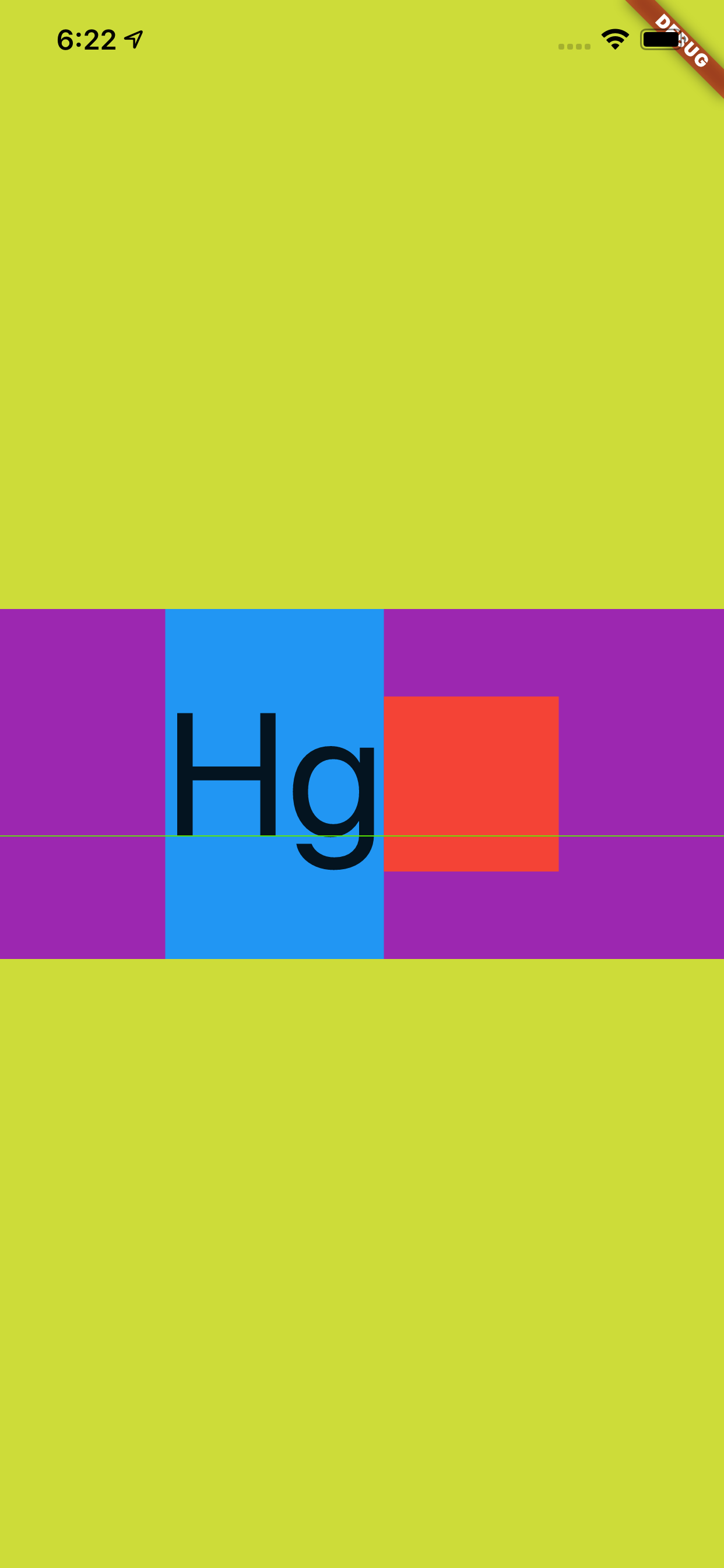
如下代码所示,可以看到 StrutStyle 的 fontSize 为 100 ,height 为 1,按照前面的介绍,蓝色的区域大小应该是和红色小方块一样大。
然后我们设置了 TextStyle 的 backgroundColor 为具有透明度的绿色,结果如下图所示,可以看到 backgroundColor 的区域超过了 StrutStyle,显示为默认情况下字体的度量。
  @override
  Widget build(BuildContext context) {
    return Scaffold(
      backgroundColor: Colors.black,
      body: Container(
        color: Colors.lime,
        alignment: Alignment.center,
        child: Container(
          alignment: Alignment.center,
          child: Container(
            height: 200,
            color: Colors.purple,
            alignment: Alignment.center,
            child: new Row(
              mainAxisAlignment: MainAxisAlignment.center,
              children: <Widget>[
                Container(
                  color: Colors.blue,
                  child: new Text(
                    "Hg",
                    style: TextStyle(
                      fontSize: 100,
                      backgroundColor: Colors.green.withAlpha(180)
                    ),
                    strutStyle: StrutStyle(
                      forceStrutHeight: true,
                      fontSize: 100,
                      height: 1,
                    ),

                  ),

                ),
                Container(
                  height: 100,
                  width: 100,
                  color: Colors.red,
                )
              ],
            ),
          )

        ),
      ),
    );
  }
这是不是很有意思,事实上也可以反应出,字体的度量其实一直都是默认的 ascent + descent = fontSize,我们可以改变 TextStyle 的 height 或者 StrutStyle 来改变行高效果,但是本质上的 fontSize 其实并没有变。
如果把输入内容换成 "H\ng" ,如下图所示可以看到更有意思的效果。
最后再介绍一个属性 :TextStyle 的 TextBaseline,因为这个属性一直让人产生“误解”。
关于 TextBaseline 有两个属性,分别是 alphabetic 和 ideographic ,为了更方便解释他们的效果,如下代码所示,我们通过 CustomPaint 把不同的基线位置绘制出来。
  @override
  Widget build(BuildContext context) {
    return Scaffold(
      backgroundColor: Colors.black,
      body: Container(
        color: Colors.lime,
        alignment: Alignment.center,
        child: Container(
          alignment: Alignment.center,
          child: Container(
            height: 200,
            width: 400,
            color: Colors.purple,
            child: CustomPaint(
              painter: Text2Painter(),
            ),
          )

        ),
      ),
    );
  }

class Text2Painter extends CustomPainter {
  @override
  void paint(Canvas canvas, Size size) {
    var baseLine = TextBaseline.alphabetic;
    //var baseLine = TextBaseline.ideographic;

    final textStyle =
        TextStyle(color: Colors.white, fontSize: 100, textBaseline: baseLine);
    final textSpan = TextSpan(
      text: 'My文字',
      style: textStyle,
    );
    final textPainter = TextPainter(
      text: textSpan,
      textDirection: TextDirection.ltr,
    );
    textPainter.layout(
      minWidth: 0,
      maxWidth: size.width,
    );

    final left = 0.0;
    final top = 0.0;
    final right = textPainter.width;
    final bottom = textPainter.height;
    final rect = Rect.fromLTRB(left, top, right, bottom);
    final paint = Paint()
      ..color = Colors.red
      ..style = PaintingStyle.stroke
      ..strokeWidth = 1;
    canvas.drawRect(rect, paint);

    // draw the baseline
    final distanceToBaseline =
        textPainter.computeDistanceToActualBaseline(baseLine);

    canvas.drawLine(
      Offset(0, distanceToBaseline),
      Offset(textPainter.width, distanceToBaseline),
      paint..color = Colors.blue..strokeWidth = 5,
    );

    // draw the text
    final offset = Offset(0, 0);
    textPainter.paint(canvas, offset);
  }

  @override
  bool shouldRepaint(CustomPainter oldDelegate) => true;
}
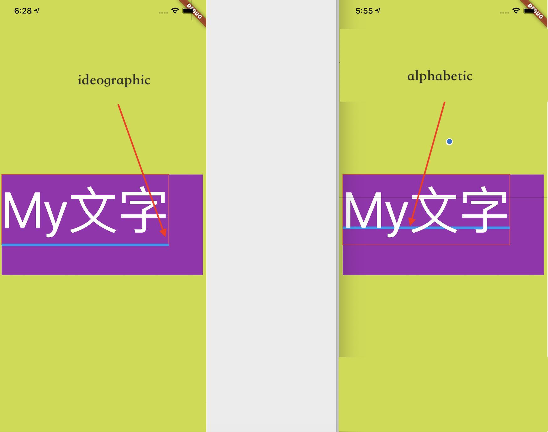
如下图所示,蓝色的线就是 baseLine,从效果可以直观看到不同 baseLine 下对齐的位置应该在哪里。
但是事实上 baseLine 的作用并不会直接影响 TextStyle 中文本的对齐方式,Flutter 中默认显示的文本只会通过 TextBaseline.alphabetic 对齐的,如下图所示官方人员也对这个问题有过描述 #47512。
这也是为什么要用
CustomPaint展示的原因,因为用默认Text展示不出来。
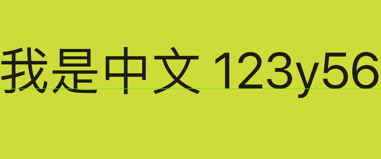
举个典型的例子,如下代码所示,虽然在 Row 和 Text 上都是用了 ideographic ,但是其实并没有达到我们想要的效果。
 @override
  Widget build(BuildContext context) {
    return Scaffold(
      backgroundColor: Colors.black,
      body: Container(
        color: Colors.lime,
        alignment: Alignment.center,
        child: Container(
            alignment: Alignment.center,
            child: Row(
                crossAxisAlignment: CrossAxisAlignment.baseline,
                textBaseline: TextBaseline.ideographic,
                mainAxisSize: MainAxisSize.max,
                children: [
                  Text(
                    '我是中文',
                    style: TextStyle(
                      fontSize: 55,
                      textBaseline: TextBaseline.ideographic,
                    ),
                  ),
                  Spacer(),
                  Text('123y56',
                      style: TextStyle(
                        fontSize: 55,
                        textBaseline: TextBaseline.ideographic,
                      )),
                ])),
      ),
    );
  }
关键就算
Row设置了center,这段文本看起来还是不是特别“对齐”。
自从,关于 Flutter 中的字体相关的“冷”知识介绍完了,不知道你“无用”的知识有没有增多呢?
此处可能存在不合适展示的内容,页面不予展示。您可通过相关编辑功能自查并修改。
如您确认内容无涉及 不当用语 / 纯广告导流 / 暴力 / 低俗色情 / 侵权 / 盗版 / 虚假 / 无价值内容或违法国家有关法律法规的内容,可点击提交进行申诉,我们将尽快为您处理。


