

代码拉取完成,页面将自动刷新
An elegant Flutter Dialog solution.
The Dialog that comes with the system actually pushes a new page, which has many benefits, but there are also some difficult problems to solve
The above pain points are all fatal, of course, there are some other solutions, such as:
Obviously, the use of Overlay is the most portable. At present, many toast and dialog three-party libraries use this solution. Some loading libraries are used. After reading the source code, the penetration background solution is very different from the expected effect. The dialog library comes with toast display, but toast display cannot coexist with dialog (toast is a special information display and should be able to exist independently), so I need to rely on one more Toast library
Based on the above difficult problems, I can only implement it myself. It took some time to implement a Pub package. Basically, the pain points that should be solved have been solved, and there is no problem in actual business
dependencies:
  flutter_smart_dialog: any
void main() {
  runApp(MyApp());
}

///flutter 2.0
class MyApp extends StatelessWidget {
  @override
  Widget build(BuildContext context) {
    return MaterialApp(
      home: Container(),
      builder: (BuildContext context, Widget? child) {
        return FlutterSmartDialog(child: child);
      },
    );
  }
}

///flutter 1.x
class MyApp extends StatelessWidget {
  @override
  Widget build(BuildContext context) {
    return MaterialApp(
      home: Container(),
      builder: (BuildContext context, Widget child) {
        return FlutterSmartDialog(child: child);
      },
    );
  }
}
Use FlutterSmartDialog to wrap the child, and then you can use SmartDialog happily
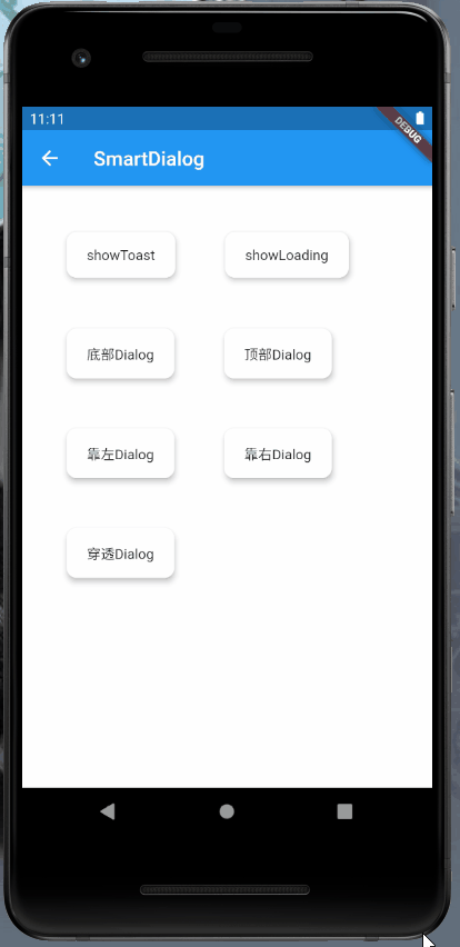
SmartDialog.showToast('test toast');
SmartDialog configuration parameter description below
//open loading
SmartDialog.showLoading();

//delay off
await Future.delayed(Duration(seconds: 2));
SmartDialog.dismiss();
Temp, which are consistent with the following parameters without the suffix of Temp
isUseExtraWidget: whether to use an additional overlay floating layer, it can be separated from the main floating layer; it can be separated from loading, dialog, etc. The built-in showToast turns on this configuration and can coexist with loadingSmartDialog.show(
alignmentTemp: Alignment.bottomCenter,
clickBgDismissTemp: true,
widget: Container(
color: Colors.blue,
height: 300,
),
);
instance, causing inconvenience to use, many parameters here are managed by config attribute in instance
| Parameters | Function description |
|---|---|
| alignment | Control the position of the custom control on the screen Alignment.center: The custom control is located in the middle of the screen, and the animation defaults to: fade and zoom, you can use isLoading to select the animation Alignment.bottomCenter, Alignment.bottomLeft, Alignment.bottomRight: The custom control is located at the bottom of the screen, the animation defaults to displacement animation, bottom-up, you can use animationDuration to set the animation time Alignment.topCenter, Alignment.topLeft, Alignment.topRight: The custom control is located at the top of the screen, and the animation defaults to displacement animation. From top to bottom, you can use animationDuration to set the animation time Alignment.centerLeft: The custom control is located at On the left side of the screen, the animation defaults to displacement animation, from left to right, you can use animationDuration to set the animation time Alignment.centerRight: The custom control is located on the left side of the screen, and the animation defaults to displacement animation, from right to left. You can use animationDuration to set the animation time |
| isPenetrate | Default: false; whether to penetrate the background of the mask, control after interactive mask, true: click to penetrate the background, false: not penetrate; set the penetration mask to true, the background mask will automatically become transparent (Required) |
| clickBgDismiss | Default: true; click the mask, whether to close the dialog---true: click the mask to close the dialog, false: not close |
| maskColor | Mask color |
| animationDuration | Animation time |
| isUseAnimation | Default: true; whether to use animation |
| isLoading | Default: true; whether to use Loading animation; true: use fade animation for content body false: use zoom animation for content body, only for the middle position control |
| isExist | Default: false; Whether the main SmartDialog (OverlayEntry) exists on the interface |
| isExistExtra | Default: false; whether additional SmartDialog (OverlayEntry) exists on the interface |
SmartDialog.instance.config
    ..clickBgDismiss = true
    ..isLoading = true
    ..isUseAnimation = true
    ..animationDuration = Duration(milliseconds: 270)
    ..isPenetrate = false
    ..maskColor = Colors.black.withOpacity(0.1)
    ..alignment = Alignment.center;
There is basically a problem when using Overlay's dependency library. It is difficult to monitor the return event, which makes it difficult to close the pop-up window layout when the return event is violated. After thinking of many ways, there is no way to solve the problem in the dependency library. Here is one BaseScaffold, use BaseScaffold on each page to solve the problem of closing Dialog in return event
typedef ScaffoldParamVoidCallback = void Function();

class BaseScaffold extends StatefulWidget {
  const BaseScaffold({
    Key? key,
    this.appBar,
    this.body,
    this.floatingActionButton,
    this.floatingActionButtonLocation,
    this.floatingActionButtonAnimator,
    this.persistentFooterButtons,
    this.drawer,
    this.endDrawer,
    this.bottomNavigationBar,
    this.bottomSheet,
    this.backgroundColor,
    this.resizeToAvoidBottomInset,
    this.primary = true,
    this.drawerDragStartBehavior = DragStartBehavior.start,
    this.extendBody = false,
    this.extendBodyBehindAppBar = false,
    this.drawerScrimColor,
    this.drawerEdgeDragWidth,
    this.drawerEnableOpenDragGesture = true,
    this.endDrawerEnableOpenDragGesture = true,
    this.isTwiceBack = false,
    this.isCanBack = true,
    this.onBack,
  })  : assert(primary != null),
        assert(extendBody != null),
        assert(extendBodyBehindAppBar != null),
        assert(drawerDragStartBehavior != null),
        super(key: key);

  final bool extendBody;
  final bool extendBodyBehindAppBar;
  final PreferredSizeWidget? appBar;
  final Widget? body;
  final Widget? floatingActionButton;
  final FloatingActionButtonLocation? floatingActionButtonLocation;
  final FloatingActionButtonAnimator? floatingActionButtonAnimator;
  final List<Widget>? persistentFooterButtons;
  final Widget? drawer;
  final Widget? endDrawer;
  final Color? drawerScrimColor;
  final Color? backgroundColor;
  final Widget? bottomNavigationBar;
  final Widget? bottomSheet;
  final bool? resizeToAvoidBottomInset;
  final bool primary;
  final DragStartBehavior drawerDragStartBehavior;
  final double? drawerEdgeDragWidth;
  final bool drawerEnableOpenDragGesture;
  final bool endDrawerEnableOpenDragGesture;

  ///增加的属性
  ///点击返回按钮提示是否退出页面,快速点击俩次才会退出页面
  final bool isTwiceBack;

  ///是否可以返回
  final bool isCanBack;

  ///监听返回事件
  final ScaffoldParamVoidCallback? onBack;

  @override
  _BaseScaffoldState createState() => _BaseScaffoldState();
}

class _BaseScaffoldState extends State<BaseScaffold> {
  DateTime? _lastPressedAt;

  @override
  Widget build(BuildContext context) {
    return WillPopScope(
      child: Scaffold(
        appBar: widget.appBar,
        body: widget.body,
        floatingActionButton: widget.floatingActionButton,
        floatingActionButtonLocation: widget.floatingActionButtonLocation,
        floatingActionButtonAnimator: widget.floatingActionButtonAnimator,
        persistentFooterButtons: widget.persistentFooterButtons,
        drawer: widget.drawer,
        endDrawer: widget.endDrawer,
        bottomNavigationBar: widget.bottomNavigationBar,
        bottomSheet: widget.bottomSheet,
        backgroundColor: widget.backgroundColor,
        resizeToAvoidBottomInset: widget.resizeToAvoidBottomInset,
        primary: widget.primary,
        drawerDragStartBehavior: widget.drawerDragStartBehavior,
        extendBody: widget.extendBody,
        extendBodyBehindAppBar: widget.extendBodyBehindAppBar,
        drawerScrimColor: widget.drawerScrimColor,
        drawerEdgeDragWidth: widget.drawerEdgeDragWidth,
        drawerEnableOpenDragGesture: widget.drawerEnableOpenDragGesture,
        endDrawerEnableOpenDragGesture: widget.endDrawerEnableOpenDragGesture,
      ),
      onWillPop: dealWillPop,
    );
  }

  Future<bool> dealWillPop() async {
    if (widget.onBack != null) {
      widget.onBack!();
    }

    if (SmartDialog.instance.config.isExist) {
      SmartDialog.dismiss();
      return false;
    }

    if (!widget.isCanBack) {
      return false;
    }

    if (widget.isTwiceBack) {
      if (_lastPressedAt == null ||
          DateTime.now().difference(_lastPressedAt!) > Duration(seconds: 1)) {
        _lastPressedAt = DateTime.now();

        SmartDialog.showToast("Click again to exit");
        return false;
      }
      return true;
    } else {
      return true;
    }
  }
}
typedef ScaffoldParamVoidCallback = void Function();

class BaseScaffold extends StatefulWidget {
  const BaseScaffold({
    Key key,
    this.appBar,
    this.body,
    this.floatingActionButton,
    this.floatingActionButtonLocation,
    this.floatingActionButtonAnimator,
    this.persistentFooterButtons,
    this.drawer,
    this.endDrawer,
    this.bottomNavigationBar,
    this.bottomSheet,
    this.backgroundColor,
    this.resizeToAvoidBottomInset,
    this.primary = true,
    this.drawerDragStartBehavior = DragStartBehavior.start,
    this.extendBody = false,
    this.extendBodyBehindAppBar = false,
    this.drawerScrimColor,
    this.drawerEdgeDragWidth,
    this.drawerEnableOpenDragGesture = true,
    this.endDrawerEnableOpenDragGesture = true,
    this.isTwiceBack = false,
    this.isCanBack = true,
    this.onBack,
  })  : assert(primary != null),
        assert(extendBody != null),
        assert(extendBodyBehindAppBar != null),
        assert(drawerDragStartBehavior != null),
        super(key: key);

  final bool extendBody;
  final bool extendBodyBehindAppBar;
  final PreferredSizeWidget appBar;
  final Widget body;
  final Widget floatingActionButton;
  final FloatingActionButtonLocation floatingActionButtonLocation;
  final FloatingActionButtonAnimator floatingActionButtonAnimator;
  final List<Widget> persistentFooterButtons;
  final Widget drawer;
  final Widget endDrawer;
  final Color drawerScrimColor;
  final Color backgroundColor;
  final Widget bottomNavigationBar;
  final Widget bottomSheet;
  final bool resizeToAvoidBottomInset;
  final bool primary;
  final DragStartBehavior drawerDragStartBehavior;
  final double drawerEdgeDragWidth;
  final bool drawerEnableOpenDragGesture;
  final bool endDrawerEnableOpenDragGesture;

  ///增加的属性
  ///点击返回按钮提示是否退出页面,快速点击俩次才会退出页面
  final bool isTwiceBack;

  ///是否可以返回
  final bool isCanBack;

  ///监听返回事件
  final ScaffoldParamVoidCallback onBack;

  @override
  _BaseScaffoldState createState() => _BaseScaffoldState();
}

class _BaseScaffoldState extends State<BaseScaffold> {
  DateTime _lastPressedAt;

  @override
  Widget build(BuildContext context) {
    return WillPopScope(
      child: Scaffold(
        appBar: widget.appBar,
        body: widget.body,
        floatingActionButton: widget.floatingActionButton,
        floatingActionButtonLocation: widget.floatingActionButtonLocation,
        floatingActionButtonAnimator: widget.floatingActionButtonAnimator,
        persistentFooterButtons: widget.persistentFooterButtons,
        drawer: widget.drawer,
        endDrawer: widget.endDrawer,
        bottomNavigationBar: widget.bottomNavigationBar,
        bottomSheet: widget.bottomSheet,
        backgroundColor: widget.backgroundColor,
        resizeToAvoidBottomInset: widget.resizeToAvoidBottomInset,
        primary: widget.primary,
        drawerDragStartBehavior: widget.drawerDragStartBehavior,
        extendBody: widget.extendBody,
        extendBodyBehindAppBar: widget.extendBodyBehindAppBar,
        drawerScrimColor: widget.drawerScrimColor,
        drawerEdgeDragWidth: widget.drawerEdgeDragWidth,
        drawerEnableOpenDragGesture: widget.drawerEnableOpenDragGesture,
        endDrawerEnableOpenDragGesture: widget.endDrawerEnableOpenDragGesture,
      ),
      onWillPop: dealWillPop,
    );
  }

  Future<bool> dealWillPop() async {
    if (widget.onBack != null) {
      widget.onBack();
    }

    if (SmartDialog.instance.config.isExist) {
      SmartDialog.dismiss();
      return false;
    }

    if (!widget.isCanBack) {
      return false;
    }

    if (widget.isTwiceBack) {
      if (_lastPressedAt == null ||
          DateTime.now().difference(_lastPressedAt) > Duration(seconds: 1)) {
        _lastPressedAt = DateTime.now();

        SmartDialog.showToast("Click again to exit");
        return false;
      }
      return true;
    } else {
      return true;
    }
  }
}
此处可能存在不合适展示的内容,页面不予展示。您可通过相关编辑功能自查并修改。
如您确认内容无涉及 不当用语 / 纯广告导流 / 暴力 / 低俗色情 / 侵权 / 盗版 / 虚假 / 无价值内容或违法国家有关法律法规的内容,可点击提交进行申诉,我们将尽快为您处理。
 马建仓 AI 助手


